When you start designing your landing page, a thousand plans and ideas float in your mind, and you try your hand and leg to design it more than perfectly.
Starting from the color scheme to placement of elements, pricing, services, features, etc., everything brings a lot of confusion.
The issue here is that most webmasters design a homepage that appeals to the eyes but skip something thousand times more important, which is conversion.
What’s the use of an ultra-attractive landing page, which can’t send the visitor to the right pages and push them further in the funnel of conversion?
Our experts have got experience of over two decades in digital marketing, and after researching thousands of landing pages, we’ve brought you the most effective trucks to design your landing page.
If you truly want to add that “magical thrust” to your business, undoubtedly, landing pages are going to play a huge role, and you can’t skip considering search engine crawlers and Spyders either.
So, summing everything together, we’ve finally come up with a double-perfect guide for you.
But how’s a landing page different from the home page?
Many folks assume that both the landing page and home page mean the same, but the word of knowledge here, they’re entirely different.
Yes, both of them have separate purposes, and both need to be perfect in order to make the whole website successful.
Wait here. Let’s, first of all, explain what a landing page actually is, and we’ll keep it short, though, as we’re gonna stretch that further into this article.
All of us talk about bringing traffic to the website, but the question is, where exactly to bring them on your website?
For that, there’s a special page called a landing page. Let’s explain further.
What’s the importance of the landing page?
A landing page actually plays a distinctive role, and it’s more like a promotional tool. It will highly focus on getting the visitor to do an action. For example, making them sign up for your email list, subscribe to any of your services, or buy a product. Landing pages normally eliminate the navigation options (home, contact us, about, etc.) so that you don’t tap back. Landing pages are specially designed to:
- Receive traffic from a single or numerous specific sources (for example, an ad or email campaign)—thus, the term “landing.”
- Prompt viewers to take one action that’s well-defined.
- Stay concentrated on a single topic or provide throughout the page.
- Omit or downplays options of navigation
- Act as a semi-permanent or separate part of your site
What is a homepage?
A homepage is basically the very first page most individuals will view when they visit your website after entering your name or company in the search bar. It should immediately tell a visitor what your services/business is about and a bit about the author. A homepage acts as a hub for the rest of your site as well, permitting visitors to scroll around and learn more about your business. It normally has these key factors:
- It offers an enormous overview of what your business does
- Occupies the root domain (consider www.yourwebsite.com)
- Links to each of the other essential permanent page of your site
- Shows visitors the method to connect with you in additional ways. For example, getting in touch with you personally or giving you a follow on social media.
Are landing pages necessary?
If it’s just about getting your business online, you might prefer to focus on building your website with a responsive homepage. Eventually, as you ramp up the marketing efforts with the help of email and ad campaigns, you’ll be beginning to use landing pages to snatch prospects to take certain actions to produce leads and sell your stuff.
They’ll enable you to focus on some specific call to action. It can be an offer, which allows you to add key persuasive components to that page. Besides that, they let you gather essential customer data, for example, how effective an ad campaign you run was and from where you’re driving your most traffic. Landing pages have numerous benefits.
Therefore, we advance you using them if building your email list is what your intention is with leads or promoting any of your products or services.
Can you have a landing page without a homepage or website?
There is no necessarily a need for a site to have a landing page. A landing page will live on the island as a stand-alone page. However, we’d suggest that being temporary might lead you to an end while you build a highly permanent website design as websites do offer your leads and purchasers essential information in order to build brand credibility.
That said, if your last goal is to gather more leads for your business, creating a large multi-page website is not necessarily needed to achieve that destination. You could craft a simple landing page, which is completely concentrated on gathering leads.
It’s true; you can craft a landing page without having a website or homepage. However, as they typically serve different requirements, we advise you to use both as part of your digital marketing toolkit.
The overview above would have given you a big & clear picture understanding of every page type’s role and the way they work. But things really begin to clear once you dig into certain scenarios. Now, let’s take a closer look at when you should be using a landing page vs. a homepage.
Effective Landing Page Design Tips for Magical Conversions
Below is an inclusive list of points that your landing page should include to have visitors engaged and continue their conversion path.
Determine a specific goal and your target audience for the landing page
Before you start to design your landing page, you need to be sure about your exact goal. You can look upon your central goal as the ethic of designing the landing page, as after that only, you’ll be able to design it perfectly.
Just take a primary example here. Your website offers several services related to email marketing, and first of all, you designed your landing page for selling email lists there, but later, you switched your target to selling email verification service.
Don’t you think it’s all going to mess up, and you can’t expect high conversions after that mess? So, do spend some time thinking about what exactly is your primary service and goal going to be before designing the landing page, and stay stuck to that.
Also, ensure that you don’t get too greedy while designing the landing page. If you enter too many goals on your landing page, you won’t be able to flaunt the services or explain them that well. The flow will break, and it may simply frustrate the visitors.
Never hesitate in designing different landing pages for different goals. Send targeted audiences to all of them rather than gathering the whole mob at a single page, and get tense due to low conversion rates.
But what sort of conversion are you looking for?
Conversions can come in several ways. The word “conversion” has many meanings. In simple words, if you successfully make the user complete the action you desired, it’s a conversion for you. But what exact action? Let’s understand the various sorts:
- Sales: This is the most common sort of conversion (because it’s the most materialistic one). Showcase any specific product’s value benefits and by providing the user with the option to buy w/o leaving the landing page.
- Capturing sign-ups: Here, you offer something highly valuable (can be guided, tips, ideas, or even coupons/discounts) to a specific group of audience and ask for their email address in return.
- Take part in any seminars/sessions: Here, your core target is to offer knowledge (or opportunities) and ask to join your subscriber list or social media accounts, or we say YouTube/Telegram, etc.

Remember, you won’t be able to convert the visitors if the targeted people aren’t visiting your landing page.
Short & Sweet Yet professional Layout
Having a clean layout, minimal elements, and offering a value proposition are all basics to be necessity considerations, but what are the deeper points for designing the landing page’s layout. How can you fulfill your motto without over-displaying or stuffing?
Keeping your primary goal intact, your landing page should have the following factors:
- Large headings for differentiating them from the rest of the text. Heading always needs to be catchy.
- Smaller body text to briefly describe your offering. Ovoid stretching your text, as it may bore the readers.
- Keep section headings short and simple. The same goes with the paragraphs.
- Lead Capture form should ask for too many details,
- CTA should be distinctive, attractive, and no over-stuffing of CTAs should be there.
- Relevant image (should be high quality and well compressed).
Graphics & Text Alignment
A landing page without appealing graphics and design can hardly attract anybody. Virtual data truly plays a vital role in increasing conversions. What would you love to cherish, a pack of 5 small paragraphs written in normal text, or the same displayed in an infographic?
Obviously, the second option!
Video, images, and infographics always attract eyeballs faster than normal text. The landing page is a single-purpose page, so you need to think quality over quantity when selecting media. Keeping the copyright issue in mind, you should invest time and money in designing highly appealing customized pics as it’s entirely worth it.
Avoid using generic images to reduce trustworthiness and make the landing page less authentic in readers’ eyes. Instead, using professional and impactful graphics will outshine the landing page. You can be a bit humorous as well, but again, ensure to stay within the limit.
Ensure proper alignment and line length if the section body text is long. It is recommended to:
- Left-align text that exceeds two lines – avoid centering or justifying until it’s thoroughly needed.
- Keep the paragraphs’ text lines short and easily understandable.
- Don’t use professional English but don’t include too many hard words if you really want to target all segments of the audience (as all are not native English speakers).
- Avoid keeping the text size too small otherwise, viewing it on mobile devices will be a challenge.
- Last but not least, don’t choose any extra funky font family. Just go with what’s professional, and don’t divert the reader’s mind.
Select Colors to Stand Out
Now, we’re not gonna advise which color to choose for your landing page, as it’s already understood that it shouldn’t be something too far from your website’s color scheme. Just understand which colors resonate the best with the landing page.
You may find a few experts claiming that using Black, White, and Gray is the best and most professional. But don’t you think it’s too mainstream? Don’t you think it would reflect that you didn’t even try to put effort into choosing the perfect color scheme?
Our advice is to use contrasting colors for your landing pages. If you’re using Royal Blue and white as the primary color scheme of your website, then just don’t stick to that.
What about adding a bit of spice of appeal by adding a few more shades of Blue?
Also, if your business operates in several countries and cultures, you may need to build separate campaign landing pages based on each audience’s culture. It may happen that what the color scheme Australian audience loves might not appeal to the Japanese audience.
Utilize color to highlight crucial page features and draw people’s attention, rather than just for the sake of it. For example, if your primary color scheme, as we said, is Blue and White, a light blue-colored CTA button would hardly appeal to anyone.
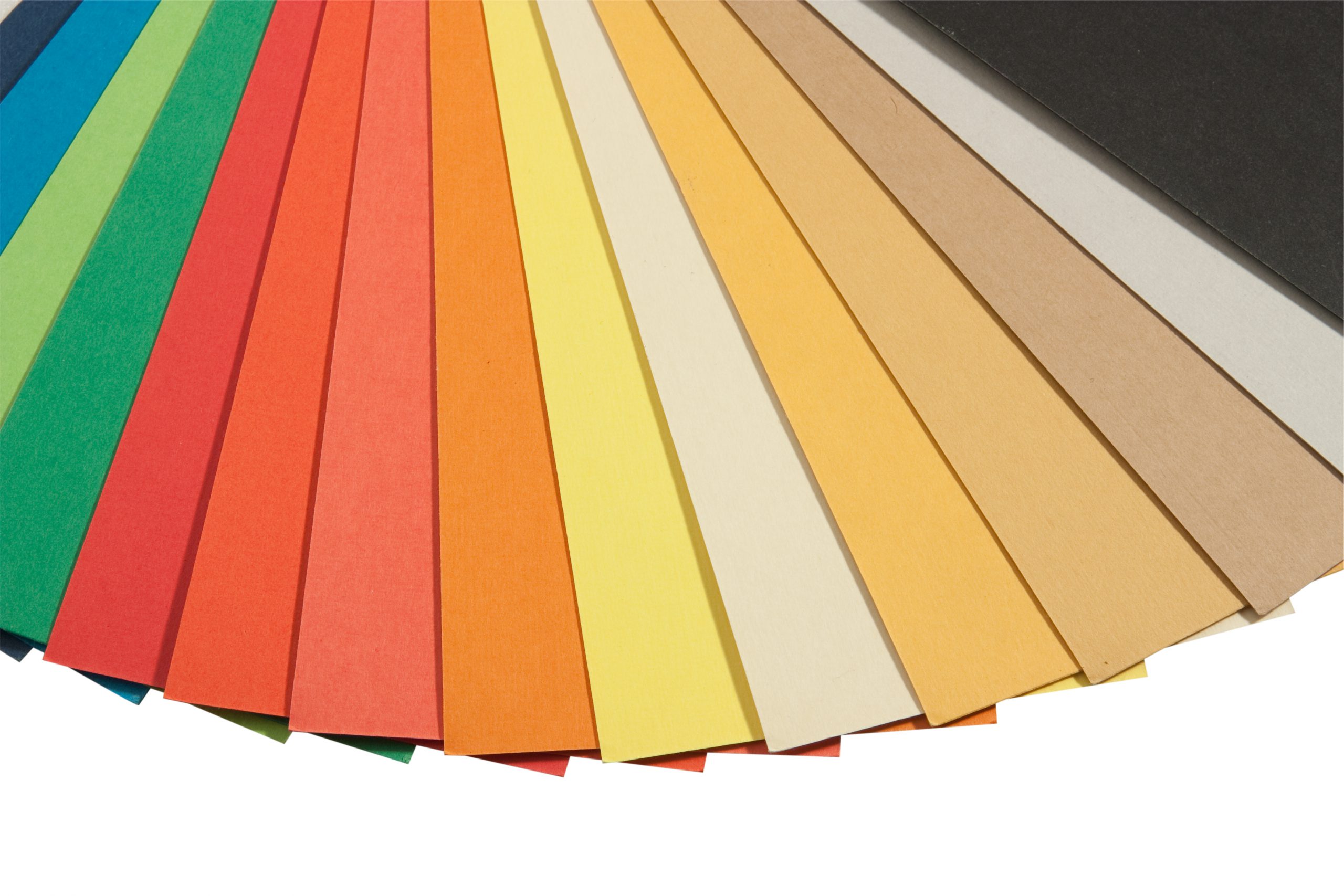
It’s also equally important to pick a color palette that relates to your company’s overall personality. Here are the 8 colors and the psychology behind each, with a few examples of the best sites which use those color schemes:
- Blue – trust, loyalty, wisdom, confidence, intelligence (example: AccuwebHosting)
- Red – energy, strength, power, determination (example: Chrome)
- Orange – joy, sunshine, tropics (example: WildSouls)
- Yellow – happiness, intellect, energy (example: TrekStocks)
- Green – growth, harmony, freshness (example: Thomas Vegetable)
- Purple – power, nobility, luxury (example: LintenseTemplate)
- White – faith, purity (example: Awwwards)
- Black – power, elegance, formality (example: EatTheOrdinary)
Forms’ design and their length & Depth
The core reason behind designing landing pages is to convert the user, and that’s the reason we never recommend you to add any extra clicks on your landing page. The form should appear as a “one-piece” rather than any extra drop down, which creates doubts in the user’s mind regarding the length. Avoid using funky styles, and stay sober.
The form needs to be directly available. Rather than requiring users to click to complete forms, embedding them immediately into the site would speed their experience and enhance conversions. The design of the form also matters besides the length, as when it comes to entering details in the forms, all of us feel lethargic.
Some marketers believe that only extremely brief forms are effective. “Just let them know your most attractive offer, and ask for the email address,” they suggest. Anything more would be excessive.”
But a single rule won’t fit everyone.
For example, let’s consider expensive products/services? Don’t you think the buyer would need deeper info before getting a conversion?
A lengthier form proves to be effective in qualifying leads for an expensive product/service. You’ll get fewer leads, but cheer up, as they’ll be better-qualified leads.
What’s the real life example of that?
For instance, If you have a web development and design company, asking about the potential customer’s budget and requirements can save you tons of time. Suppose a customer looking to hire a developer at a $5/hr rate probably won’t utilize your service if your minimum hourly rate starts from $10.
What if you didn’t display that in your form? You’ll waste time asking the clients for requirements, help them, and at the end, come to know that it’s actually not your deal. How harsh!
Display Authority Symbols and Include Support Information
It’s a true fact that web visitors convert more to authoritative sites.
You should mention the awards, certificates, etc., or claim to be experts relevant to the landing page’s topic. This claim of authority on a subject will notify the visitor of your capability without requiring them to navigate to other pages on your website. In short, they’ll trust that filling emails, forms, or even buying anything will be beneficial.
Rather than just displaying yourself as an expert, you also need to act the same. Yes, you’ll get queries, and you’ll have to solve them. FAQs can eliminate the hassle of attending to all the questions.
Including popular FAQs or other easy ways to contact your support team will appeal to visitors on the front. FAQs won’t quench all the queries. Contact information is compulsory, and you may present the same to your website visitors in numerous ways. You can utilize a contact form or include your phone number or email address on your landing page.
Now as the customer is relieved that he’ll get the info he needs, he is clearly more likely to get converted, as doubts are eliminated.
Persuasive CTA
The call to action (CTA) can be called the “main character” of the film. CTA’s design, placement, size, words used in it, etc., play a bigger role than you expect. CTAs might invite visitors to subscribe, fill out a form, share on social media, and more, but they’ll work only if your products/services are appealing.
Styling and language are the two core components of a CTA. Do take time while styling the CTA, and ensure the button isn’t too big or small. Also, it should be bold and eye-catching, using complementary colors, specific sizes, and padding to generate leads. Language should be actionable and must be able to communicate the value effectively.
For example, your CTA button could read:
- Unlock features for only $5
- Claim Your Discount Today
- Get Website Audit For Free
- Request a Free Quote
As you can see, price, free, discount, hurry, etc. sort of words prove to be highly appealing and lure viewers into tapping on it. Besides that, 3D buttons also generate the urge to click. Also, avoid using monotonous CTAs. Design at least 2-3 types so that it grabs attention every time. You can even point an arrow towards it!
Use scarcity techniques
To create the fear of missing out in your readers, the two best elements that you can use are urgency and scarcity. Just make it evident that your offerings are either in great demand or in short supply, and your visitors will feel compelled to take action right away that you desire.
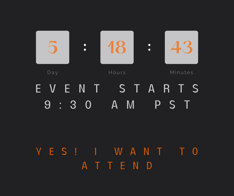
Terms like “limited time” and “limited quantity” are working fabulously for years in digital marketing due to the same reason. A countdown timer can give scarcity a visual element. It notifies your visitors how much time they have to respond to an offer. You can find several websites using this trick and reaping benefits as well.
Use a limited-time deal or a lead magnet to do the same thing on your website. Here’s an excellent illustration of scarcity and urgency wherein a countdown timer is used to create a sense of urgency in the audience:
Navigation bars? Nah-huh
Using too many navigation links on your landing page will kill your conversion rate. Never include distractions like top navigation, footers, social media links, sidebar navigation – anything that distracts users from filling out your form or clicking on your button should be ignored.
Your landing page should have a sole purpose; the simpler it is, the more your CTAs will be noticed, and the fewer the outgoing links, the more the visitor will stay engaged.
If you add more links on your landing page, it won’t benefit you because it takes only one click to get your prospects to opt-out and leave and decrease your conversion rate.
Offer Value Above the Fold
The area of your landing page that is instantly visible to viewers is referred to as “above the fold.”
Your core target shouldn’t be the conversion (we really mean that), and it should be offering value. Placing your core values on the first page above the fold (which means at the top) will make visitors see a vital glimpse of what you’re giving and where they can take action. It will increase interest in the reader to navigate your landing page further.
Keep the most crucial content and call-to-action at the top of the page at all times to make that strong first impression.” You should also push the elements like the awards, testimonials, etc., as up as possible.
But don’t get stressed about what to add at the top. Remember everything can’t be pushed at the top, and also, don’t forget that you’ve also got the rest of the page to fill.
Optimize your landing pages for speed and mobile
You’ve added all the needed spices to your landing page, and now it’s ready to offer you amazing conversions, but wait!
What if it fails to load within time, or appears a “failure” on mobile devices?
Competitors would truly love you if you let your web visitors pass on to them just because of slow loading speed. There are tons of ways to increase the speed of your landing page, and here’ what you’re supposed to do:
- Compress and optimize your images
- Use a fast and reliable web hosting
- Get a caching plugin
- Keep your website updated
- Use a CDN (content delivery network).
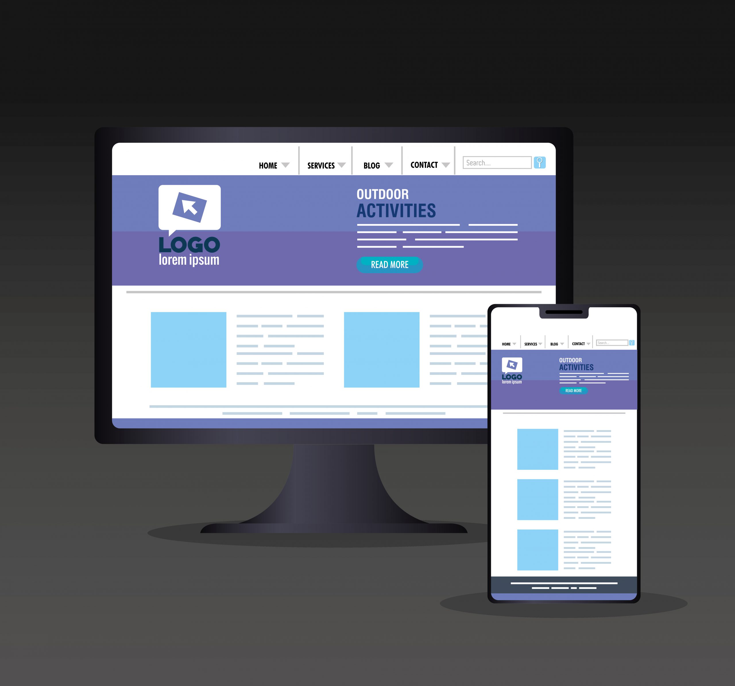
Make your landing pages mobile-responsive so that you never miss conversion opportunities. We all use our phones to check social media and emails, and that’s where the big game lies. So, if a prospect hits an advertisement, it would be a shame for your website if the elements don’t load properly. That’s actually the silliest mistake possible.
And here comes the helping hand
Properly planned and designed landing pages give wings to any business, and all you need is to be strategic. Designing landing pages isn’t a thing to do in haste. Perfection is the utmost need.
One little element here and there can bring unbelievable change (both positive and negative). So, why not take expert help here when you already know that there are going to be solid results.
Here’s the helping hand from the AccuWebTech developer. Just share your idea of the landing page, we’ll polish it up, and even if you don’t have any proper idea, we’ve got specialists to display some stunning ideas.
Most importantly, we don’t believe in tearing pockets as various other developer companies do! Rely on us, and we bet you’ll be happy : )

Leave a Reply