“As time passes, different things become acceptable.” You might have heard this proverb a thousand times. While some call it a cliché, it is an absolute fact.
On this same note, web design trends change with respect to time. It is quite evident that the web design elements and techniques of the days of Tim Berners-Lee – the man who developed the World Wide Web – is flawlessly different from today’s.
So today, let’s look at the top 15 upcoming web design trends we are expecting in 2018. (Although the web design trends are much more numerous, this piece looks at 15 – which are the most important.)
The Basic Web Design Definition
As an introduction, let’s define web design in the simplest form possible:
Web design is a combination of elements and techniques used to produce the visual components of a website or web app. Basically, web design deals with almost everything you see on a website or web app.
The History of Web Design (Shortened Version)
In 1989, Tim Berners-Lee invented the World Wide Web (not the Internet, actually). Those days, the first websites on the World Wide Web consisted of nothing more than simple text pages. The websites were accessed by a simple line-mode browser.
This continued until 1993 when software engineer Marc Andreessen and programmer Eric Bina created an improved browser called Mosaic. Other browsers were Unix-based and paid no attention to graphical elements like images and web design elements.
Then, in 1994, W3C was created to make the World Wide Web more functional and fully operational to its potential. The W3C shattered the dreams of companies that were planning to monopolize the World Wide Web by creating a programming language and propriety browser.
Soon, Andreessen founded Communications Corp. The company became Netscape Communications in a few months and the Netscape browser was brought to the world. Netscape was a general upgrade to other browsers because it created its own standards and HTML tags.
The rule of Netscape came to an end when Microsoft launched Internet Explorer (formerly known as Microsoft Internet Explorer). It was all about Netscape vs. Microsoft. That was when web design revolutionized.
During the time, new and advanced technologies such as Dynamic HTML, CSS (Cascading Style Sheets) and JavaScript came to the scene. Microsoft introduced even more competitive features and technologies.
However, when web design started gaining a great deal of attention, everything else was left out completely. Websites were designed with good web design elements but aspects such as web accessibility, semantics and markup structure received very little attention.
Web designers started making complex designs using complicated table structures. Then, attention went back to CSS that was introduced back in 1996. CSS offered better web design elements while paying attention to other web development aspects. That same year, Flash (formerly known as FutureSplash) was developed. Although Flash was very basic and limited then, it helped web designers go beyond ordinary HTML, JavaScript and even animated GIFs.
One could expect Flash to take over the whole web design industry. But unfortunately, most web designers ignored Flash because it required a plug-in. As a result, most web designers stuck to animated GIFs and JavaScript (used primarily for widgets).
However, Flash became successful after the majority of web designers decided to overcome the market share compatibility obstacle. With Flash, CSS, animated GIFs, JavaScript and the likes, web design became a prominent phase of the web development process.
Top 15 Upcoming Web Design Trends in 2018
1. Mobile or Nothing
It’s no more news that mobile browsing is king. In 2016, mobile browsing successfully surpassed desktop browsing – with more than 50 percent of users reaching the Internet through mobile devices like smartphones and tablets.
This is only practical because most online shoppers place orders at the ease of their mobile devices. Although this process was very difficult for most designers and users to adapt with, the majority of people are now coming to terms with this development. As such, mobile-friendliness is the ultimate web design trend of 2018.
Now, this is somewhat difficult to perfectly submit to. Most web designers still find it difficult to make a website or web app with decent features (like menus) to function properly on mobile devices. Fortunately, this is a thing of the past as mobile-friendly web designs are already (almost) perfect.
With the introduction of AMP, we can all admit it’s mobile or nothing. Google, the Internet king, is serious about websites and their mobile-friendliness. Mobile AMP pages load absolutely faster and so will help businesses grow and convert better.
2. The Bright Side of Colors
Colors are one of life’s little wonders. Now, the web design industry is going overboard with brighter colors. These colors are bright enough to make a tangible statement.
The transition of colors is an actual trend that is widely accepted by web designers and a majority of other industrial designers. The year 2018 will see a lot of web designers using brighter color gradients.
A prominent company already going down this lane in 2017 is Instagram. The company have substituted their regular elements with brighter logos, buttons, and multi-colour gradients.
However, there is a caution. Web design enthusiasts should truly understand color before creating a mix of beautiful colors and not just flashy, meaningless color combinations.
In 2018, brighter colors alongside bolder fonts will likely overcome images – especially on mobile devices. This only makes sense since colors and fonts will apparently load faster than images no matter the size.
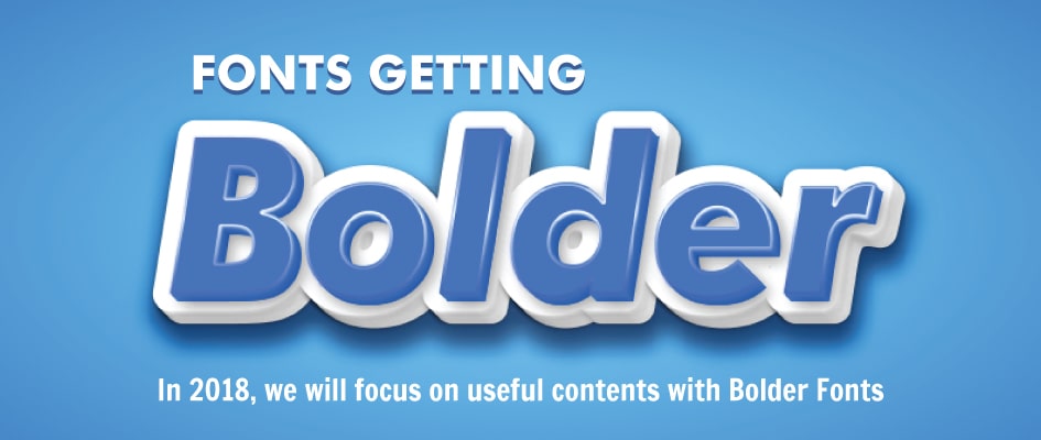
3. Fonts Getting Bolder
Similar to brighter colors, designs are deemed to come with bolder fonts. This is only logical because bold style fonts are attention-grabbing. They will help businesses attract more customers.
In 2018, we will focus on useful contents. With bolder fonts, useful contents are deemed to catch more attention and, in turn, generate more income. Along with brighter colors and more whitespace, people will spend more time on such websites implementing this combo in 2018.
Naturally, people only skim through pages. With this perfect combination, skimming through pages will be easier and more convenient. Once the users are comfortable with the experience, the website is halfway successful.
In turn, web design will receive more props. Web designers are realizing this simple fact and will incorporate it into their web design arsenal in 2018.
4. Asymmetrical Grid Layouts
With the recent release of CSS Grid Layout in March 2017, designers are opting for asymmetrical grid layouts. Navigation becomes extremely easy. Each page is tied down to a defined theme. Although this theory has a long history, 2018 will watch it become one of the most used web design trends in history.
In fact, WordPress and similar CMSs have started using irregular and asymmetrical grid layouts for their default themes or templates. There are far more options for web designers to use to create creative grid designs using the CSS Grid Layout.
In 2018, asymmetrical grid layouts will likely be used with more whitespace to create an irresistible interface for users and customers to interact with.
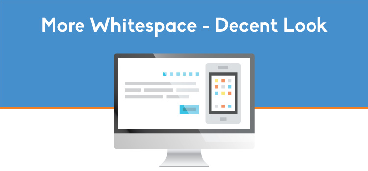
5. More Whitespace
Whitespace, or negative space, share the same age as the Internet itself. But recently, web designers are putting this space to very good use. Whitespace was very natural and perfectly overlooked in the past. In 2018, web designers will use more effectively.
For one, whitespace makes web pages faster to fully load and lightweight – especially on mobile devices. Web designers are gradually grabbing a sense of marketing, the aspect of conversion. When a website loads faster, bounce rate will reduce and more visitors will visit the website. Therefore, the conversion rate will increase exponentially.
This is an addition to the asymmetry craze currently going on in the web design industry. Web designers will make use of more whitespace in 2018.
6. The Rise of Micro-Interactions
The craze of micro-interactions is evident in 2017. Social networks have been using this technique to increase interaction between users – and it has proved effective. It has become an inevitable element of a network like Facebook.
Micro-interactions are seamless and can do nothing but help websites increase interactivity. For example, a real estate company can implement a floating chatbot to increase interaction with clients.
Micro-interactions are effective because they make it easy for the users to communicate, interact and share. Micro-interactions powered by artificial intelligence are even better.
This is an upgrade to the static user experience. While micro-interactions make it easy to interact, traditional website interactions require more time. For instance, adding a comment on most blogs will reload the page. This seems fine, but with micro-interactions that do everything in an instance, the former is evidently outdated.
7. Scroll-Triggered Animations
Browsers these days can handle animations far better than before. Not until now, animations were disturbing on most browsers. However, in 2018, browsers will be able to handle a wide range of animations. Fortunately, web designers know this and are working towards creating useful animations.
Scroll-triggered animations among others have been on the rise in 2017. They require little data, and still look as beautiful as expected. This type of animations makes transitions more creative and more appealing to the user. It increases engagement and makes it rewarding for users to keep scrolling – while reducing bounce rate, in turn.
In addition, scroll-triggered animations help increase conversion rates by displaying the business’ products and/or services, and by pulling users to conversion points faster and more effectively.
Ultimately, scrolled animated triggers are particularly cleaner than other types of triggers.
8. Sticky Elements at the Bottom
For a long period, web designers and developers have been having a hard time deciding between the top or bottom. I’m talking about the good old sticky menus and elements. They are not new, but the placement have always been debated for long.
Recently, it seems we can agree on sticky elements being placed at the bottom. Most mobile apps now have their sticky elements at the bottom, although some still stick to the top of the screen.
Web apps and websites, similarly, are implementing more bottom-placed sticky elements than ever. Sticky elements at the bottom will be a web design trend of 2018.
9. Science That’s Driven by Data
From the Internet of Things to Machine Learning and Artificial Intelligence, science is widely having its way in web design. 2018 will see a lot of web designers making brilliant designs with data science in mind.
With the Internet of Things (IoT), you can connect your devices to the Internet. IoT has proven to be very helpful in our everyday lives. In 2018, more web designs will be presented with IoT interfaces. The interface will let the user interact with smart devices. So, it’s a hot deal for the users. With the help of server-side processing and sensor rays, devices connected to the IoT act on their environments.
Artificial Intelligence (AI) and Machine Learning, on the other side, helps web design to be more advanced and technology-driven. With the likes of TheGrid and Sensei by Adobe, AI tools will be incorporated in web design in 2018.
Lastly, all these data science disciplines require a solid back-end interface. So, web designers will partner with more web developers in 2018.
10. Say Yes to Scalable Vector Graphics
It’s a pity! Web designers are gradually substituting well-known image extensions (like PNG, JPG and GIF) with SVGs (Scalable Vector Graphics).
This is as a result of attention being paid to quality-driven images and how accessible the images are. SVG files are all that come to mind when these factors are considered.
More and more designers are saying yes to this image extension so it’ll definitely be a trend in 2018. In addition, SVG images have smaller sizes without losing their qualities. SVG images are the combination of lines, instead of pixels. Also, they are very easy to scale – which is particularly good for responsive website designs.
Concurrently, Photoshop is gradually becoming a thing of the past. Designers are now using Sketch to produce high-quality graphics elements. A major advantage of Sketch over Photoshop is its ease in creating website layouts, plus how fast they can be done.
11. Progressive Web App
Progressive Web App might be the newest web design trend in 2018. Basically, Progressive Web App is a hybrid of web and app behaviors. This means web designers will blend app elements with those of web to create even more brilliant designs.
Features like push notifications and animated page transitions will be implemented on websites more often in 2018.
Further, websites using Progressive Web App get used to its users over time. When there is a solid relationship, pages will load faster, push notifications will be sent, home screen icons will appear, and other perks will come with it.
What’s even better? No installation is required, just a visit and you’re on the go.
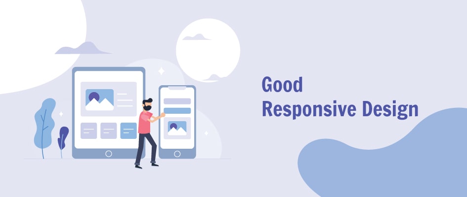
12. The Good Old Responsive Design
We can all agree the responsive web design is the ultimate web design fashion statement. Responsive design is more of a discipline than a trend. Despite its overwhelming history, web design is still growing accustomed to responsive web design.
So, responsive design will be one of the most important web design trends 2018 and – maybe – beyond. Responsive design is very important because it is the epitome of cross-platform and cross-browser.
When a website is designed with responsive elements, it will function perfectly on smartphones, tablets, desktops, TVs, and others. In 2018, Augmented Reality and Virtual Reality will be another reason for responsive designs.
13. Upfront Illustrations
With bespoke and unique illustrations, the death of images is near the corner. They are just better in every bit. They are upfront, and right in the user’s face.
They grab attention faster and engage with your audience like magic. Also, they trigger emotions. When a website is designed with bespoke and unique illustrations, there is a solid brand reputation and uniqueness.
However, it’s highly recommended to stick with normal, static images if you’re designing an ecommerce website. If otherwise, you can be happy with unique, creative illustrations.
14. The Art of Oblique Shapes
I’ve always believed shapes are a form of art. One of the most unexpected web design trends of 2017 and 2018 is the use of oblique, organic shapes. What this means is a religious avoidance of card-based UIs for new, improved organic UIs.
In fact, authority companies such as Facebook, Twitter and Google have ditched card-based elements for oblique elements. Most noticeably, Twitter is currently using curve-cornered (and almost oval) shapes for their boxes, cards, avatars, and other elements.
15. Mainstream Brutalism
Design enthusiasts call brutalism the ability of designers to do whatever they want – not what they are supposed to do. If there’s one thing a creative person want, it is the freedom to run wild with his creativity.
This is why brutalism has hit the mainstream in 2017, and 2018 is even more promising. Brutalism requires designers to neglect whatever experts call “rules.”
Optimization, looks, colour schemes, effects, and more universal rules are absolutely left out of the picture. Instead, we see more web designers displaying raw talent by doing whatever they like as soon as it makes sense.
In fact, the e-commerce websites of Gucci and Balenciaga have jumped on this bandwagon. Brace yourself for a brutal 2018!
Why Do Web Design Trends Change Over Time?
It is perfectly safe to say designers get bored easily, and with time. The fashion trends of 2007 are outrageously outdated just 10 years later.
First, let’s define the word “trend.” According to Merriam-Webster, a trend is
- A prevailing tendency or inclination
- A current style or preference
- A line of development
- The general movement over time of a statistically detectable change
With these definitions, we can say a trend is bound to change with respect to time. Regarding the fact that web design takes up at least 30 percent of the whole web development process, web design practices get better with time.
In the course of getting better, new and improved techniques and elements take over previously accepted counterparts. This is the basic cause of web design trends changing over time.
However, web design trends – similar to fashion trends – sometimes come back at a point in time. So, trends just come, go and recycle the process with zero innovations.
Further, the opinion of an industry expert is another major reason why web design trends change over time. The minimalist design has been the Internet fashion statement for the past few years, purely influenced by German industrial designer Dieter Rams. The year 2017 ruled that out with a lot of authority websites and e-commerce shops opting for the new (and odd) maximalist design.
However, some web design elements and techniques are practically timeless. Great examples are responsive web design and mobile-friendliness – they are here to stay!
Web Design vs. Web Development
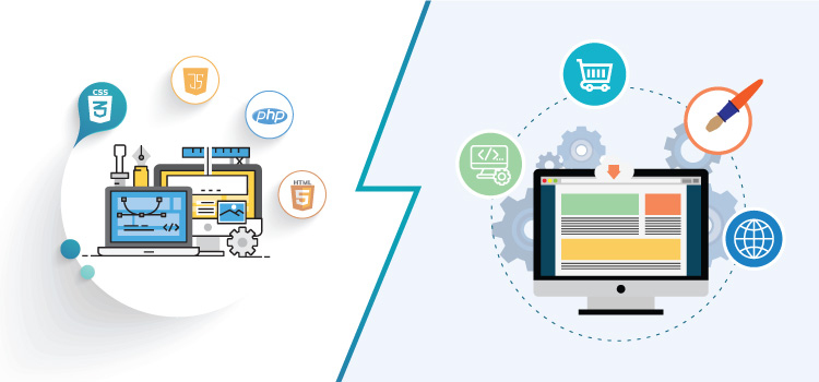
One reasonable question most entry-level website owners, developers, and designers ask is the difference between web design and web development. Although many people use them interchangeably, web design and web development are two different disciplines. So, a web designer and a web developer are two different professionals.
Web development is the whole production of a website or web app from the back-end to the front-end, while web design is only concerned with the front-end (layout, content, and graphics). With this, we can say web design is a fragment of web development.
The main difference can be drawn to front-end and back-end interfaces. Below is a clear explanation of these two terms.
Front-End Interface: Front-end development is the production of what people see when they visit a website or web app. It’s the separation of the presentation layer from the whole structure. So, it’s basically everything the user directly interacts with when visiting a website or web app.
Back-End Interface: On the other side is the back-end interface, which is the other half of the whole structure. While the front-end deals with what the user interacts with directly, the back-end deals with whatever the user interacts with indirectly. So, the user interacts with the back-end without knowing. This is because the back-end interacts with the front-end, or more precisely, powers the front-end.
To simplify both interfaces, let’s use a motor vehicle as an example. The internal combustion engine of a motor vehicle is what powers the car. The body and main parts, interior, and electronics of the motor vehicle, on the other hand, are what the driver feels and interacts with. The driver steers the steering wheel to manipulate the front wheels. While the steering wheel is steerable because of some rods connected to the front wheels.
In this manner, the engine and the connection rods are the back-end components powering and enabling the motor vehicle. While the majority of the other parts are the front-end, which the driver interacts with to get the motor vehicle moving.
Conclusion
Trends come and go. The cycle is simple and straightforward. As such, web designers and individuals – who want to make a website using a do-it-yourself website design tool or from scratch – should be open to the upcoming web design trends in 2018.
The responsive web design trend became an Internet anthem with the rise of cross-device browsing. In 2017, traditional web design started receiving a decline by famous web designers. In fact, famous designer Eric Meyer stated that he is an experience designer now, and no more a web designer.
The year 2018 is fast approaching and so is its unique web design trends and supposing perks that will definitely shake the whole Internet.
The web design elements, standards and practices of a few years ago are perfectly different from this year’s. So, it’s highly recommended that web designers (or experience designers) stay up-to-date with trends so as to keep up with the competition.
From the best web design trends to the most controversial, this piece has listed 15 web design techniques and elements that will be widely used in 2018.
So, get your web design spirit and learn these trends so as to make 2018 a winning year for your web design projects.

Leave a Reply